
Analysis and Predictive Modeling with Python
Wisconsin Breast Cancer Diagnostics Dataset is the most popular dataset for practice. It is an example of Supervised Machine Learning and gives a taste of how to deal with a binary classification problem.
Dataset Download
You can download the dataset from the link below or the UCI repository.
https://www.kaggle.com/priyanka841/breast-cancer-wisconsin/notebooks
https://archive.ics.uci.edu/ml/datasets/Breast+Cancer+Wisconsin+(Diagnostic)
Details of the Dataset:
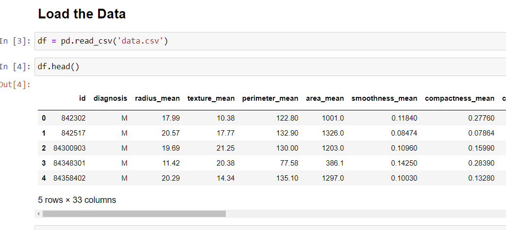
The dataset has 569 instances and 32 features. Luckily there are NO missing values.
Attributes/Features information
Attribute Information:
1) ID number
2) Diagnosis (M = malignant, B = benign)
Other Features: Ten real-valued features computed for each cell nucleus:
a) radius (mean of distances from the center to points on the perimeter)
b) texture (standard deviation of gray-scale values)
c) perimeter
d) area
e) smoothness (local variation in radius lengths)
f) compactness (perimeter^2 / area – 1.0)
g) concavity (severity of concave portions of the contour)
h) concave points (number of concave portions of the contour)
i) symmetry
j) fractal dimension (“coastline approximation” – 1)
Let’s Start: Import Libraries and Load Dataset
Let us start by importing the necessary libraries and then loading the dataset. The dataset is also available on the Kaggle webpage. The link provided above.
I have skipped the Data Visualization part for this article; the scatter plots, correlation plots, heat maps are plotted in the Kaggle notebook; for convenience sake, I have not plotted it here.
The images of the code can be are provided in the form of slides. Click on the next or previous arrow to understand the code and the data.
Task
The task is to correctly classify the target variable into Benign(B) or Malignant (M) tumor.


df.shape gives the number of instances and features (i.e. rows and columns) in the data frame.
Prepare the Data
- Drop the columns like id and unnamed which are not required.
- Map the diagnosis column into numeric form; the diagnosis column is not numeric and has to be converted into a numeric form so that algorithm can understand the data.


Data Visualization part is skipped here, for convenience sake but can be visualized from the Kaggle kernel (notebook) link. I am taking up the predictive modeling part next.
Predictive Modeling
- For training the model, the data set is split into training and test data.
- Standard practice is 70% training data and rest is test data. random_state can be any value, one can experiment with it.
- Further drop the target feature i.e., diagnosis column.
- We create X variable with will contain all the features, except the target feature
- y variable will contain the target column.
- Feature Scaling is performed, all the features in the X variable are brought to the same scale
- Standard Scaler brings the mean to zero and standard deviation to one

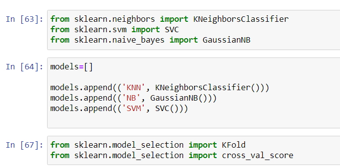
Algorithms
Here, we will explore how different algorithms/ in sklearn terminology different classifiers perform.
- Decision Tree : 90% accuracy on test data
- Random Forest: 92% accuracy on test data
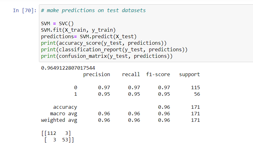
- Support Vector Machine: 96% accuracy on test data
The prediction and accuracy of other classifiers can be checked in the Kaggle Notebook.


Key Findings
The predictions can still be improved by using Ada Boost, and other ensemble algorithms.

Further Reading
I have tried to perform some Principle Component Analysis (PCA) on the same Breast Cancer Dataset. Check out the next Post to see how to fit the data into a PCA and create a new data frame. It is a basic guide to PCA.

