
Seaborn
Seaborn is a Python plotting/ Data Visualization library. It is built upon Matplotlib, and hence derives many features of matplotlib. Seaborn offers a range of plots which overcome the limitation of matplotlib. Thus, making Python a better choice for data visualization.
Python has other interactive plotting libraries, like Plotly, Bokeh, to give it a more aesthetic appeal, the same holds for R’s ggplot library.
This blog will try to achieve the following:
- Learn how to load basic libraries in Python
- Learn how to view all the datasets of Seaborn
- Check the version of Seaborn
- Load the dataset from Seaborn
- Explore the dataset
- Visualize the dataset
- Analyze the findings.
Loading the basic Libraries
We will import only two basic Python libraries for convenience and will suffice to complete our task. The code for loading the libraries and checking the version, Exploring the datasets in seaborn can be found below.


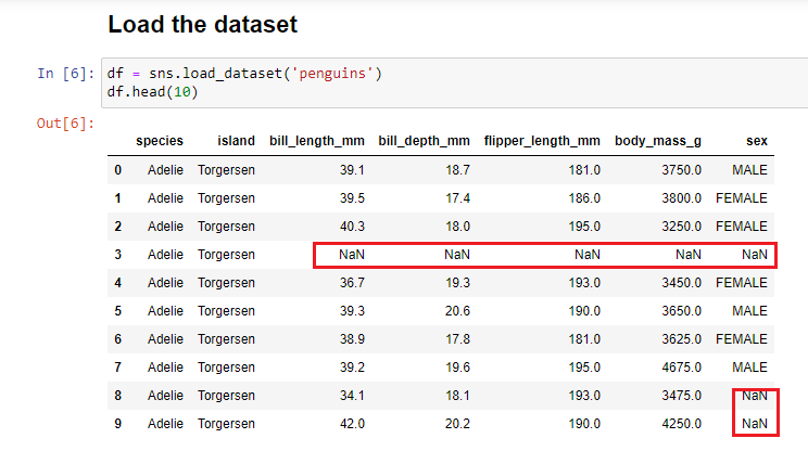
LOAD DATASET
To load the dataset from seaborn, we create an object called df and store the penguins dataset in this object. Penguins dataset is similar to the IRIS dataset. It contains three species of Penguins found in Antarctica . It is multiclass classification supervised Machine Learning task.
Details about the Dataset
The three species can be seen in the image below. We can get a general idea about the shape, weight, flippers, feet, and the bill of the penguins. Penguins are really cute!

The dataset contains the 344 rows and 7 columns/features.

With further exploration of the dataset, the features will become more clear. To make things simple let us study a simple diagram showing body parts of Penguins.

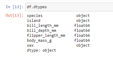
Exploring the Null Values and Data Types
There are null values in five columns out of the total seven, and the count of the null values can be observed here. The data types of sex, species, and island are object type, whereas in floating format for other features, these object data types are visualized in seaborn with count plots.
The images are displayed in a form of slideshow, the arrows will lead you to the next image.

There is yet another way to get the entire data set’s complete information without typing the above two commands. We use df.info() method to extract the information; it returns brief details on the dataset.

The data types, column names along with their data types, non-null count, memory size is returned.
Seaborn Plots
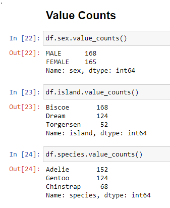
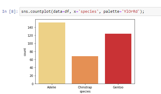
Let us now explore a few plots that seaborn has to offer. We start with Count Plots. Before we begin data visualization, let us first estimate the values in each ‘object’ type category.
The value_count() function in Pandas return counts of unique values. Very basic count plots in Seaborn.


Now, let us add a few more features to count plots to derive more information from the data. The ‘hue’ parameter makes this possible. You can experiment with various palette to make the plot look presentable.


ANALYSIS
- The count of Adelie species is maximum for both male and female penguins.
- Gentoo and Chinstrap are not found in Torgersen island.
- Chinstrap are not found in Bicoe island
- Gentoo are not found in Dream island
- Adelie species of penguins are found in all the islands.
- The male and female ratio is almost equal for all species.
Violin Plots
Violin Plots in seaborn are used to show the outliers in the dataset. It is similar to Box and Whiskers plot. Violin Plot draws the combination of boxplot and kernel density estimate. It shows the distribution of quantitative data across several levels of one (or more) categorical variables such that those distributions can be compared.
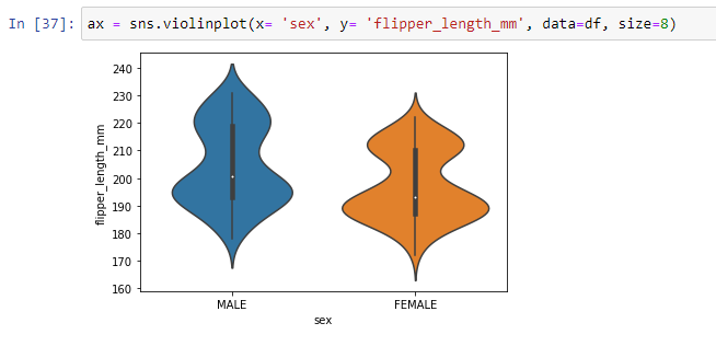


ANALYSIS
- The violin plot shows the flipper length for females is more in the range between 180-200
- Few females have flipper length more than 230mm and few have less than 170; these values are outliers in the data
- Outliers are large and small values in the dataset.
- The flipper length for Gentoo species is greater than the other two species.
- The body mass of the Gentoo penguins is more compared to Chinstrap and Adelie
Pair Plot
Seaborn offers a great way to visualize the correlation between the numeric variables with the help of pair plots. Several scatter plots are plotted to show the relationship between two numeric variables. We can easily estimate the linear, non-linear, or no relation with the help of these plots.

ANALYSIS
- There is a positive and linear relationship observed between flipper_length and body_mass of the penguin species.
- Bill_length and body_mass also have a linear relationship
- Bill_depth and flipper_length have a negative relationship
- Let us confirm these findings with the help of correlation plot.
Correlation Plots
Correlation plots are a very convenient way of finding out the correlation between the variables. It also indicates the strength, and the direction of the relationship.


ANALYSIS
- We find a negative correlation between bill_depth and flipper_length (as observed in pair plots)
- There is a positive relationship between body_mass and flipper_length.
- Negative correlation between body_mass and bill_depth
- Positive correlation between flipper_length and bill_length
Concluding Thoughts
If the penguin species’ body mass is more than we know that the flipper length will be more and the bill length, the bill depth will be less in this case.
These were a few basic plots that seaborn offers to help one understand the data and present the data visually.
- Video Tutorial:
Sources
Excellent article. I’m dealing with many of these issues as well..