
The adult UCI dataset is one of the popular datasets for practice. It is a Supervised binary classification problem.
AIM
To predict whether a person makes over 50k a year
Links to download the dataset:
Details of the Dataset
The dataset contains a mix of categorical and numeric type data.
Categorical Attributes
- workclass: Private, Self-emp-not-inc, Self-emp-inc, Federal-gov, Local-gov, State-gov, Without-pay, Never-worked.
- Individual work category
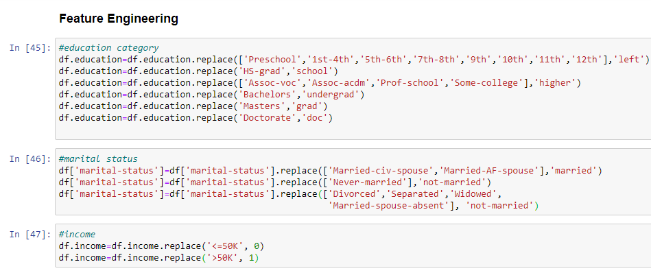
- education: Bachelors, Some-college, 11th, HS-grad, Prof-school, Assoc-acdm, Assoc-voc, 9th, 7th-8th, 12th, Masters, 1st-4th, 10th, Doctorate, 5th-6th, Preschool.
- Individual’s highest education degree
- marital-status: Married-civ-spouse, Divorced, Never-married, Separated, Widowed, Married-spouse-absent, Married-AF-spouse.
- Individual marital status
- occupation: Tech-support, Craft-repair, Other-service, Sales, Exec-managerial, Prof-specialty, Handlers-cleaners, Machine-op-inspect, Adm-clerical, Farming-fishing, Transport-moving, Priv-house-serv, Protective-serv, Armed-Forces.
- Individual’s occupation
- relationship: Wife, Own-child, Husband, Not-in-family, Other-relative, Unmarried.
- Individual’s relation in a family
- race: White, Asian-Pac-Islander, Amer-Indian-Eskimo, Other, Black.
- Race of Individual
- sex: Female, Male.
- native-country: United-States, Cambodia, England, Puerto-Rico, Canada, Germany, Outlying-US(Guam-USVI-etc), India, Japan, Greece, South, China, Cuba, Iran, Honduras, Philippines, Italy, Poland, Jamaica, Vietnam, Mexico, Portugal, Ireland, France, Dominican-Republic, Laos, Ecuador, Taiwan, Haiti, Columbia, Hungary, Guatemala, Nicaragua, Scotland, Thailand, Yugoslavia, El-Salvador, Trinidad Tobago, Peru, Hong, Holland-Netherlands.
- Individual’s native country
Continuous Attributes
- age: continuous.
- Age of an individual
- fnlwgt: final weight, continuous.
- The weights on the CPS files are controlled to independent estimates of the civilian noninstitutional population of the US. These are prepared monthly for us by Population Division here at the Census Bureau.
- capital-gain: continuous.
- capital-loss: continuous.
- hours-per-week: continuous.
- Individual’s working hour per week
Let’s get started with the loading the libraries and the dataset.


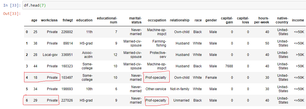
If you have noticed the data do not contains any null values but it has question marks as highlighted above. So we have options either we can drop those values or can replace them with mode values. This we shall deal later ( just keep this in mind ).
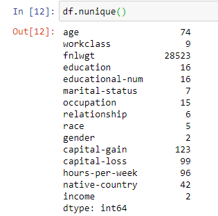
Exploring the Data
The data contains 48,842 rows and 15 columns (including the target/ output column (income) ). The data type is a mix of categorical and numeric data. We notice that there are no null values.


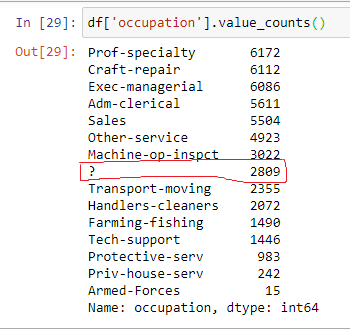
Remember the “?”
The columns/ features which have the ” ?” sign are : Workclass, Occupation and Native Country. Let’s explore a more in depth. I am using Value_Counts function to find out the count of values for every feature.
Utility of Value_Count function:
- I can easily estimate the highest and the lowest values,
- It is easy to figure out the ‘mode’ in case of categorical data.
- I can find any corrupt or noisy data, in this case ‘?’
- Helps to easily find the values needed for replacement.
- It is easy operation to perform
- Proves handy when it comes to plotting the data.


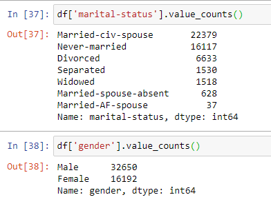
Just, for practice you can perform Value_count operation for all the columns.
Time for Solution
Let us deal with the ‘?’ now. We shall replace it with the ‘MODE’.

Let us do some Feature Engineering to make more sense from the data, as this data has a lot of information we will reduce it to make it more manageable.
Dealing with Columns
Have a look at the values and the columns, then we can reduce the number of values in that column.


Now, let us come to a more interesting part : DATA VISUALIZATION
WE shall look into the
- Histogram to study the shape of the numeric data
- BoxPlot to have an idea of outliers
- Correlation plot to study the correlation among the numeric variables
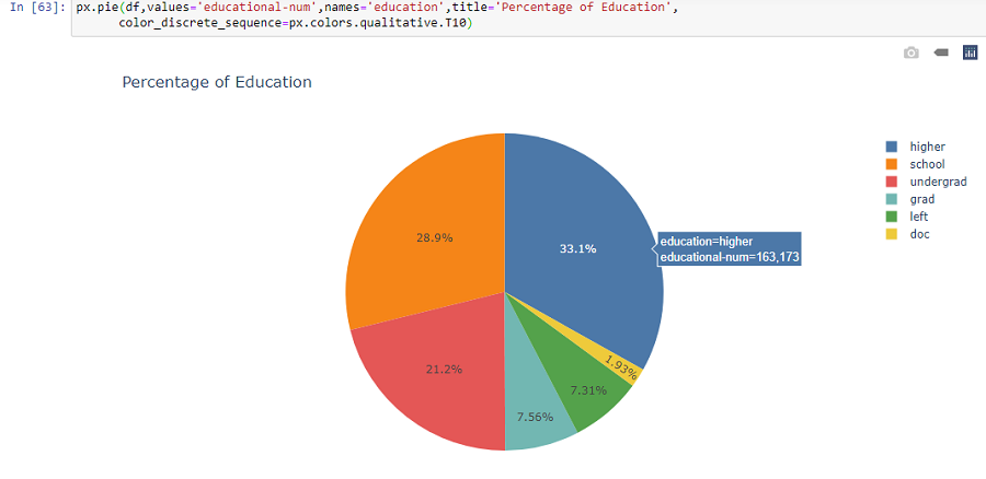
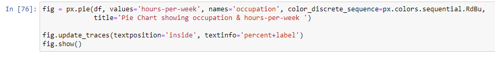
- Plotly Pie charts
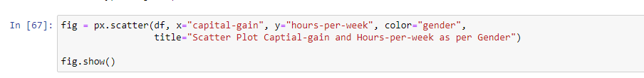
- Plotly Scatter Charts
- Countplot for the income variable


Key Findings
- The minimum age is 17 and the maximum is 90 years, most of the working age group lies between 20-40
- The minimum hours-per-week is 1 and maximum is 90, with most of the count lying between 30-40
- outliers observed in almost all the numeric features, these are the extreme values that are present in the data.
- Not very strong correlation observed among variables
Training the MODEL and Making Predictions
- Create X and y object to store the independent variable (X) and dependent variable(y).
- Perform Standard Scaling to scale the data
- Label Encoding is performed to convert the categorical data into numeric format
- Label Encoder makes the data suitable for machine
- Perform fit and Transform
- Split the dataset into train and test split


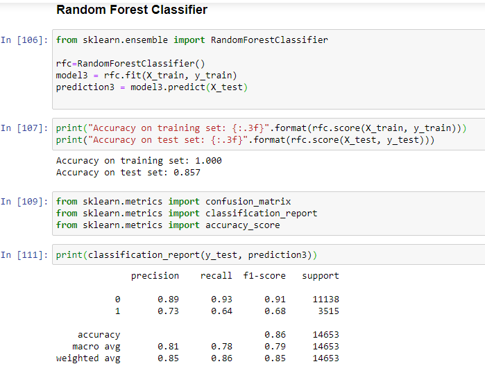
Here, I have used Logistic Regression, Decision Tree and Random Forest Classifier.


Key Findings
- Random Forest Classifier is giving the best accuracy on test data: 85%
- Logistic Regression Classifier accuracy is: 84%
- Decision Tree Classifier accuracy is: 81%
Tried to explain Confusion Matrix along with mentioning the formula and how it can be calculated for both classes.
Further Scope:
Apply Boosting Algorithms, can go parameter tuning to improve the performance of the test results.

